This assignment was to take an image of Cory Doctorow from a collection of images created by Jonathan Worth and remix it. My idea was to take the image of multiple small head shots of Doctorow and make them into postage stamps. Initially I was thinking of making them Canadian stamps with a maple leaf logo, but then I realized that a Creative Commons or Copyleft logo would be more appropriate. I got the idea for the copyleft logo from the cover of Doctorow’s Makers book where the C of his name is a stylized copyleft C. This would probably be a relatively simple project for someone with Photoshop chops, but it took me quite a while to figure out how to do basic things such as create lines of white dots and create copyleft which could then take on multiple colours. After adding the perforations, I realized that the smaller images were not on a grid, so each vertical strip needed to be cut from the original image and aligned on a black background so that the perforations would have a chance of lining up.
Remixed image licensed for reuse under a Creative Commons BY-SA license.
Initially I drew a blank when trying to think of a new story for the clip of Charlie Chaplin in the lion’s cage, but then it reminded me of the Mutual of Omaha’s Wild Kingdom television show which suggested some possibilities. Wild Kingdom is a wildlife adventure show from the seventies similar in ilk to the Undersea World of Jacques Cousteau and Steve Irwin’s Crocodile Hunter. It is narrated by a silver-haired Marlin Perkins who sits safely in a safari vehicle or in a television studio while his sidekick, Jim, confronts wild animals in various dangerous situations. Over the years it has been the subject of several spoofs.
I downloaded all the DS106 Foley sound clips and YouTube videos which had Wild Kingdom theme music and John’s Denver’s Calypso song. The audio was stripped from the YouTube videos using PwnYouTube. To edit the music clips I used Audacity to create shorter clips and to remove the voice over parts from the Wild Kingdom music. I used iMovie to remove the original audio from the Charlie Chaplin clip.
My iMovie Workspace
The video clip was pulled into iMovie then the Foley sounds were added. iMovie’s title function was used to create the title slide and the credits slides. It was also used to add the narration by Marlene Perkins. This may sound easy, but every step of the way was accompanied by rabid googling.
The movie clip that I chose to “read” was “Judge’s Game” from Rounders. This is a movie that I knew nothing about before this week and know only a little more about now. The Judge’s Game scene starts with six older men playing cards. Just after the action starts, a younger man, Mike, enters the room, comes over to the table and helps one player win the hand. The dialogue of the scene is supplemented by a narration voiced by Mike.
In this clip of 3:33 minutes I counted at least 67 camera shot changes. Most of the shots were taken from between the players as if the camera were involved in the game. Initially I thought that all of the camera shots were from one side of the table, obeying the 180 degree rule, but after trying to figure out exactly where everyone was sitting it would appear that some of the shots were from the opposite side of the table. The initial shot of this scene is the only one that shows all six of the player and is takes place from behind a desk at the eye-level of a seated person, and moves to the right, a positive movement according to Ebert. All of the shots are from this level or slightly lower, when the camera focuses on the chips and hands on the table. This makes the viewer feel a part of the game.
This scene had three main sound tracks. There are the sounds of the game – discussion, the sounds of cards and chips being moved, a track with music which is present at the beginning of the clip but fades out once Mike comes to the table and fades back in at the end of the scene when Mike leaves and a third sound track which is narrated by Mike and fills in some details of the game.
Watching the clip in three different modes helped illustrate the many threads that make up the film. Focusing on the camera angles drew attention to the importance of the camera position and how that affects how the action is perceived. Separating the sound from the action revealed the different layers that are necessary to create atmosphere.
From this clip, I would think that this movie would fall into the drama genre. It could also be a crime/gangster movie, but I don’t think there is enough information here to indicate that.
One interesting piece of trivia about this movie is that two of the main actors, Matt Damon and John Malkovich later played Tom Ripley in different film adaptions of Patricia Highsmith’s Ripley books.
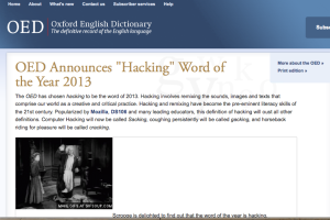
While brainstorming for ideas for today’s Daily Create, “Draw/Create an image that creates a positive connotation for the word “hacking”, I realized that I could combine this with our assignment to hack a website. What better way to give hacking a higher profile than to have the Oxford English Dictionary announce that hacking, in the sense of remixing, be the word of the year for 2013.
I used X-Ray Goggles to do the web page hacking and incorporated several chunks of text, and a couple of images, including an animated gif into the page. I found that I wasn’t able to edit all the text and tags that I wanted in the basic view, but the advanced option was more than sufficient.
The main activities during the past two weeks have related to the creation of the Merry Hacksters’ Radio Show. The whole experience was unique. I have done very little work with audio before and I have never worked on a group project that was organized and executed using Twitter as the sole communications medium. Being limited to message of 140 characters (less when you take into account that our Twitter handles took up a fifth of those letters) certainly encourages succinctness.
For our group the topic pre-dated the formation of the group and I think we all chose to join because we were interested in the subject matter, hacking and remixing . The theme was suggested by one of the group members who took the lead in organizing the structure of the project by creating a document to sketch out the plan of the show. Initially I planned to interview someone I had met about a Toy Hacking Activity that took place at a local Mini Maker Faire, but unfortunately she was out of the country on vacation. Luckily our leader put me in touch with someone else who was willing to be interviewed via Skype.
I found the project quite challenging as I had not used Audacity before starting DS106. I know a little bit about it now – how to move tracks, import audio, cut parts of tracks, do fade-ins and outs, duplicate tracks, but have more to learn. I ended up creating four short pieces as follows:
Intro
Bumper
Commercial for Mozilla Webmaker
Interview Piece with Stephanie West-Puckett
Daily Creates
During this two week period I did several daily creates. The one I spent the most time thinking about was TDC648, The Ground Beneath Your Feet. I wanted to take a picture of the actual ground, not a floor in a building, or concrete, or asphalt. It was then that I realized that during the course of a day there are only a few steps that I take on the actual ground which hasn’t had something built over it. I ended up taking a panoramic picture which, because I moved the phone too quickly, had some strange duplicated pieces. I though I might use just some of the duplicated sections, so pulled the image into Photoshop to edit it. I cropped it, but it didn’t have any real interest, so I found some special effects and applied one of them.
The image of the bookcase was created by taking a picture of a reflection in a dark window. I hadn’t thought about the effect that the screen would make on the picture, but it ended up providing an interesting grain to the photo that makes it look a bit like an oil painting on canvas.
This assignment was to create a DS106 propaganda poster using a WWII poster as its basis. I chose a poster I found on the Canada at War Forum and used Photoshop to remove some of the existing text and replace it with DS106 content. I had some difficulties finding appropriate fonts, but I was able to get the text to line up with the existing wording. I tried using the cloning stamp tool to try to blend the background and the coloured banners with the new text, but the result of doing this was much worse than having the hanging banners of colour.
This assignment is to take a cover of a well-known book and re-design the cover to suggest something completely different. I scanned my bookshelves and selected Orlando by Virginia Woolf, giving Lord Jim a miss.
Orlando to most people means Disney World, so I found an image of the Magic Kingdom on Flickr by Oscar_shen (BY-NC-SA) to use as a part of the cover.
I found a short tutorial on creating a vignette effect in Photoshop, so used that to blend the photo with the cover. The blurb is entirely made-up but applies to both Orlandos.
I have wanted to try visual note-taking for a while and have given it a couple of tries, but find that I drift to using mostly words. I bought Mike Rohde’s The Sketchnote Handbook last fall as inspiration. This week I attended a symposium on MOOCs and Libraries so decided to try visual note-taking in one of the sessions. I ran into quite a few problems. I didn’t allocate an appropriate amount of space for each of the three speakers. I rambled with the first speaker who ended up with 75% of the page real estate. My next problem was that I had ideas for things I wanted to draw but blanked out when trying to actually draw them. Luckily we had WiFi in the room so I could quickly Google for a couple of ideas. I used a black liquid gel pen and made a couple of mistakes that were hard to disguise as something else.
Next time I try this I think will follow a couple of Mike Rohde’s suggestions – prepare more ahead of time by doing a bit of background research, complete the title of the presentation before it starts and build up a stock of logos and frequently used images that can be trotted out when required.
I did my photoblitz on Saturday morning outside my house and opened the garage for some ideas. Unfortunately being under a tight deadline does not bring out my best attributes and I didn’t end up with a lot of photos. Of the few I shot, I chose the above five as the ones I most like.
The shot of two things that don’t belong (a toboggan and a pair of flippers) was made from the selection of summer and winter items in the garage. Unfortunately I placed the items up against a wall and was not able to back up far enough to properly frame them in the picture. The photo is not very good, but I hope the subject matter makes up for this.
The second photo is of some money plants that I am drying in the garage. They were lit up by sunlight coming in through a window. I was trying to capture something with mostly light shades, although there is a fair amount of dark in this picture. The seed pods themselves are quite interesting.
The picture of the dahlia is blurry and out of focus because just after I took that shot I realized that my camera was on a portrait session (for how long I am not sure) and I was not able to focus on the flower properly despite using a macro setting. I was trying for the primarily one colour photo. I like how the colours are flattened and that there is not much detail.
For the converging lines photo, I was planning to take a picture of a path leading out to the road, but it didn’t work out at all. While trying to take that photo I noticed the lines on the bricks. The photo is not very interesting but it does embody converging lines quite well.
The photo I like best is the one I took at the very end of the photoblitz when my phone alarm went off as it tells the story of the blitz. It indicates that time is up and there is a reflection of me taking the picture framed with converging lines. Needless to say this was all a happy coincidence.
The Newspaper Blackout Assignment suggests that you should “grab a marker and today’s morning edition and start blacking out sections to create a new story. It could be a poem, a picture, or a novella, all drawn from the words of the latest news”. I decided to shake this up with a bit of colour. The original article appeared in today’s Toronto Star “Edward Burtynsky’s bigger picture” (link will probably only work for a few days). The result wasn’t exactly as I had envisioned. A shorter article would have worked better as you will need to click on the image to actually read the words.