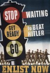
 This assignment was to create a DS106 propaganda poster using a WWII poster as its basis. I chose a poster I found on the Canada at War Forum and used Photoshop to remove some of the existing text and replace it with DS106 content. I had some difficulties finding appropriate fonts, but I was able to get the text to line up with the existing wording. I tried using the cloning stamp tool to try to blend the background and the coloured banners with the new text, but the result of doing this was much worse than having the hanging banners of colour.
DesignAssignments
Alternative Magic Realism
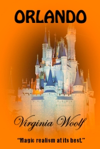
This assignment is to take a cover of a well-known book and re-design the cover to suggest something completely different. I scanned my bookshelves and selected Orlando by Virginia Woolf, giving Lord Jim a miss.
Orlando to most people means Disney World, so I found an image of the Magic Kingdom on Flickr by Oscar_shen (BY-NC-SA) to use as a part of the cover.
I found a short tutorial on creating a vignette effect in Photoshop, so used that to blend the photo with the cover. The blurb is entirely made-up but applies to both Orlandos.
Acme Doodle – Learning By Design
 I have wanted to try visual note-taking for a while and have given it a couple of tries, but find that I drift to using mostly words. I bought Mike Rohde’s The Sketchnote Handbook last fall as inspiration. This week I attended a symposium on MOOCs and Libraries so decided to try visual note-taking in one of the sessions. I ran into quite a few problems. I didn’t allocate an appropriate amount of space for each of the three speakers. I rambled with the first speaker who ended up with 75% of the page real estate. My next problem was that I had ideas for things I wanted to draw but blanked out when trying to actually draw them. Luckily we had WiFi in the room so I could quickly Google for a couple of ideas. I used a black liquid gel pen and made a couple of mistakes that were hard to disguise as something else.
Next time I try this I think will follow a couple of Mike Rohde’s suggestions – prepare more ahead of time by doing a bit of background research, complete the title of the presentation before it starts and build up a stock of logos and frequently used images that can be trotted out when required.


